2022
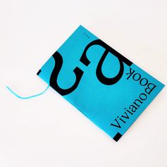
Viviano Book

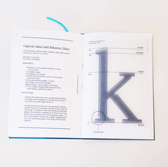
Inktrap half/slab serif
Angled, notched curves
Left and Right Text: 15 pt. Middle letter: 400 pt.
128 pt.
designosaurus
Shut my eyes, say the word, and I'm back in Italy, so many years ago, walking down the tree-lined driveway, watching him step out of the cab, billowy blue shirt, wide-open collar, sunglasses, straw hat, skin everywhere. Suddenly he's shaking my hand, handing me his backpack, removing his suitcase from the trunk of the cab, asking if my father is home. It might have started right there and then: the shirt, the rolled-up sleeves, the rounded balls of his heels slipping in and out of his frayed espadrilles, eager to test the hot gravel path that led to our house, every stride already asking, Which way to the beach?
This summer's houseguest. Another bore.
Then, almost without thinking, and with his back already turned to the car, he waves the back of his free hand and utters a careless Later! to another passenger in the car who has probably split the fare from the station. No name added, no jest to smooth out the ruffled leave-taking, nothing. His one-word send-off: brisk, bold, and blunted-take your pick, he couldn't be bothered which. You watch, I thought, this is how he'll say goodbye to us when the time comes. With a gruff, slapdash Later!
This, the very person whose photo on the application form months earlier had leapt out with promises of instant affinities.
Taking in summer guests was my parents' way of helping young academics revise a manuscript before publication. For six weeks each summer I'd have to vacate my bedroom and move one room down the corridor into a much smaller room that had once be- longed to my grandfather. During the winter months, when we were away in the city, it became a part-time toolshed, storage room, and attic where rumor had it my grandfather, my name- sake, still ground his teeth in his eternal sleep. Summer residents didn't have to pay anything, were given the full run of the house, and could basically do anything they pleased, provided they spent an hour or so a day helping my father with his correspondence and assorted paperwork. They became part of the family, and after about fifteen years of doing this, we had gotten used to a shower of postcards and gift packages not only around Christ- mastime but all year long from people who were now totally de- voted to our family and would go out of their way when they were in Europe to drop by. for a day or two with their family and take a nostalgic tour of their old digs.
Sample Text
Excerpt from Call Me By Your Name by Andre Aciman, 12 pt.
Aa Bb Cc Dd Ee Ff Gg Hh Ii Jj Kk Ll Mm Nn Oo Pp Qq Rr Ss Tt Uu Vv Ww Xx Yy Zz
1 2 3 4 5 6 7 8 9 0
, = ? : + ' . ! " ; / & -
56 pt.
56 pt.
Going into the process of developing my own original typeface, I knew I wanted to create a font that I could use to typeset the thesis book that I would be publishing the following spring. With this in mind, I decided to tackle a serif font. My goal was to produce a typeface that works well at a text weight, but with unique details that would provide intrigue at a larger scale.
To do so, I researched typefaces with serifs that had unconventional features, like Lora and Noam. I was especially interested in taking the idea of a half-slab, half-traditional serif and adding an inktrap component to that form. From there I began to trace and sketch, before I eventually moved to Fontlab to begin my digital construction.
A feature that began to creep into the characters was an angular cut across the top of the rounded letters. I began to consistently apply this element to my alphabet, while also maintaining a fully round version that I used as a proportional control. Later in the semester I incorporated the angle in a manner that followed the expansion model more traditionally. I began to look at typefaces like GT Sectra, then integrated this style in an angular, high contrast way. The current form of my typeface includes inktrap or ‘notched’ half-serifs, with a high-contrast angular component to the rounded letters. The end product was presented as a specimen book, which will later be added to, pending the addition of italic and bold weights to the font family.
Specimen book; photographed


